


The challenge was to create a design that captures the spirit of the label's emphasis on bridging the gap between artists and their audience, while also conveying a modern and sleek aesthetic that aligns with the label's focus.
The logo had to be a recognizable and memorable symbol, a versatile visual identity that resonates with both the artist and their audience, and helps to position the label as a leading player in the competitive music industry.
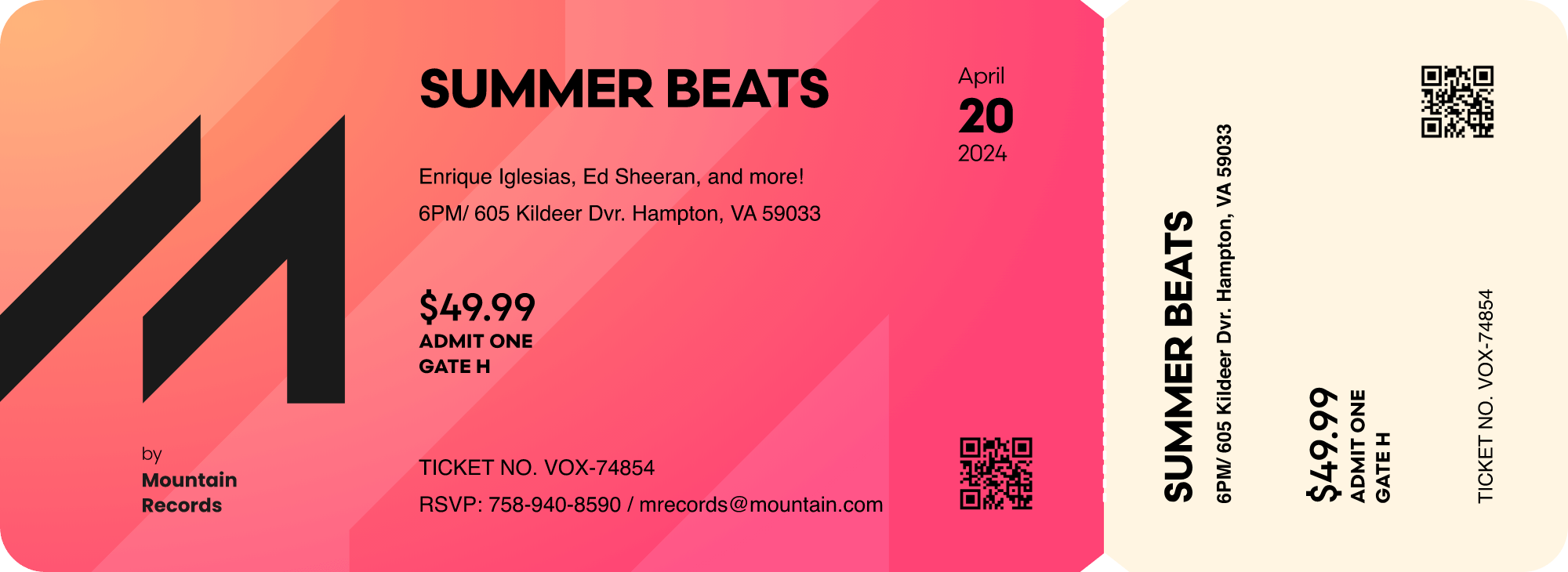
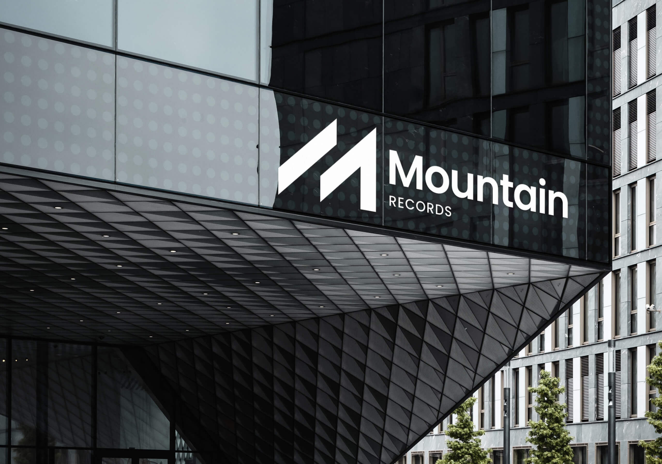

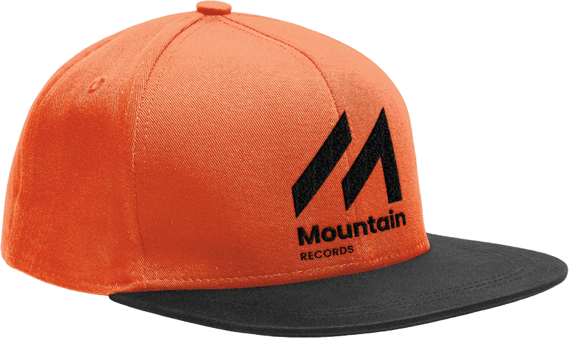
The symbol seamlessly blends with the sub-brands of the record label, creating a consistent visual identity across all products and merchandise.
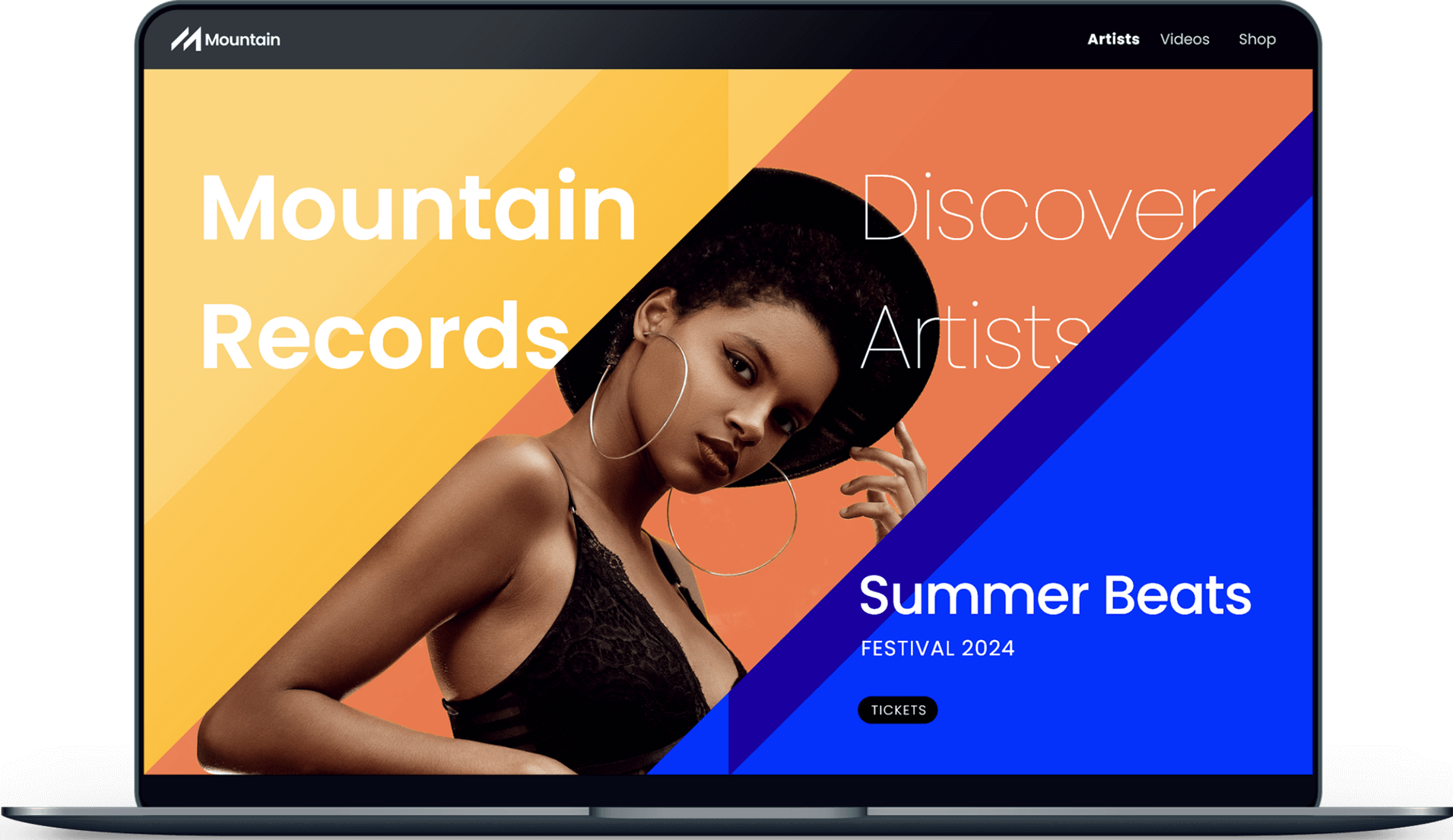
The project required designing partial visual identity parts such as event ticket and Web UI.


Designing a logo for an Instagram page was a unique challenge. I knew it had to be a symbol that stands out in a crowded space and reflects the brand's purpose: inspiring and educating people towards a healthier lifestyle.
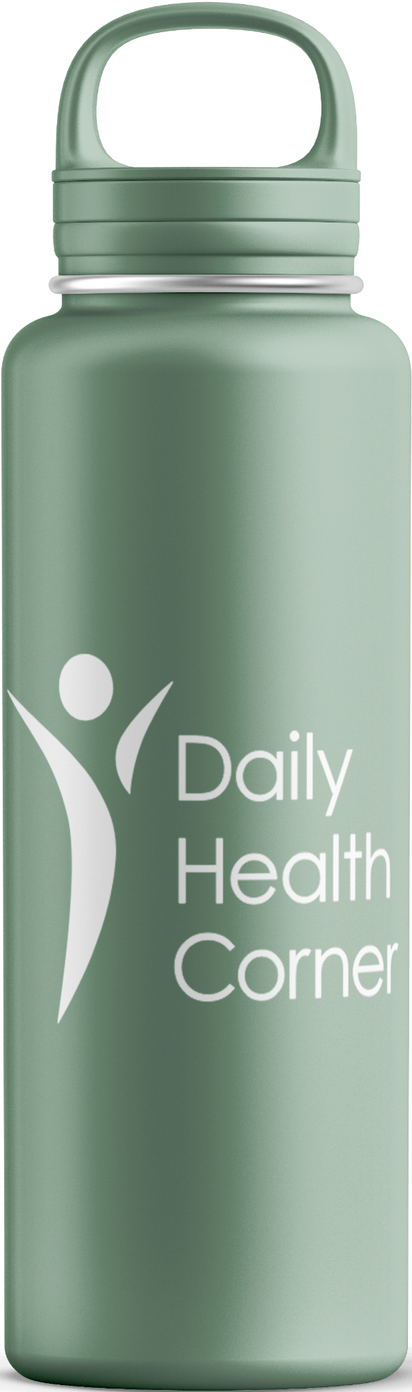
Simplicity was a main factor for easy memorability, and readability even in smaller sizes.

Along with the three-word brand name, I focused on designing a symbol that can work well as a standalone as much as in combination with the name.

The name itself has a slightly complex structure, so I opted for a clean and scalable typeface that ensures legibility on all device sizes. For the symbol, I wanted to make it memorable and recognizable at any size, so I went with a simple silhouette of a jumping person, a basic form that everyone can easily identify, and relate with.
I had the opportunity to work on a project for a local women's meeting that aimed to explore and emphasize the beauty and importance of inner femininity. The task was to design promotional materials for the event, encouraging women to give voice to their femininity.

The final result was a design that captures the essence of the women's meeting, the empowering and uplifting nature of the event.
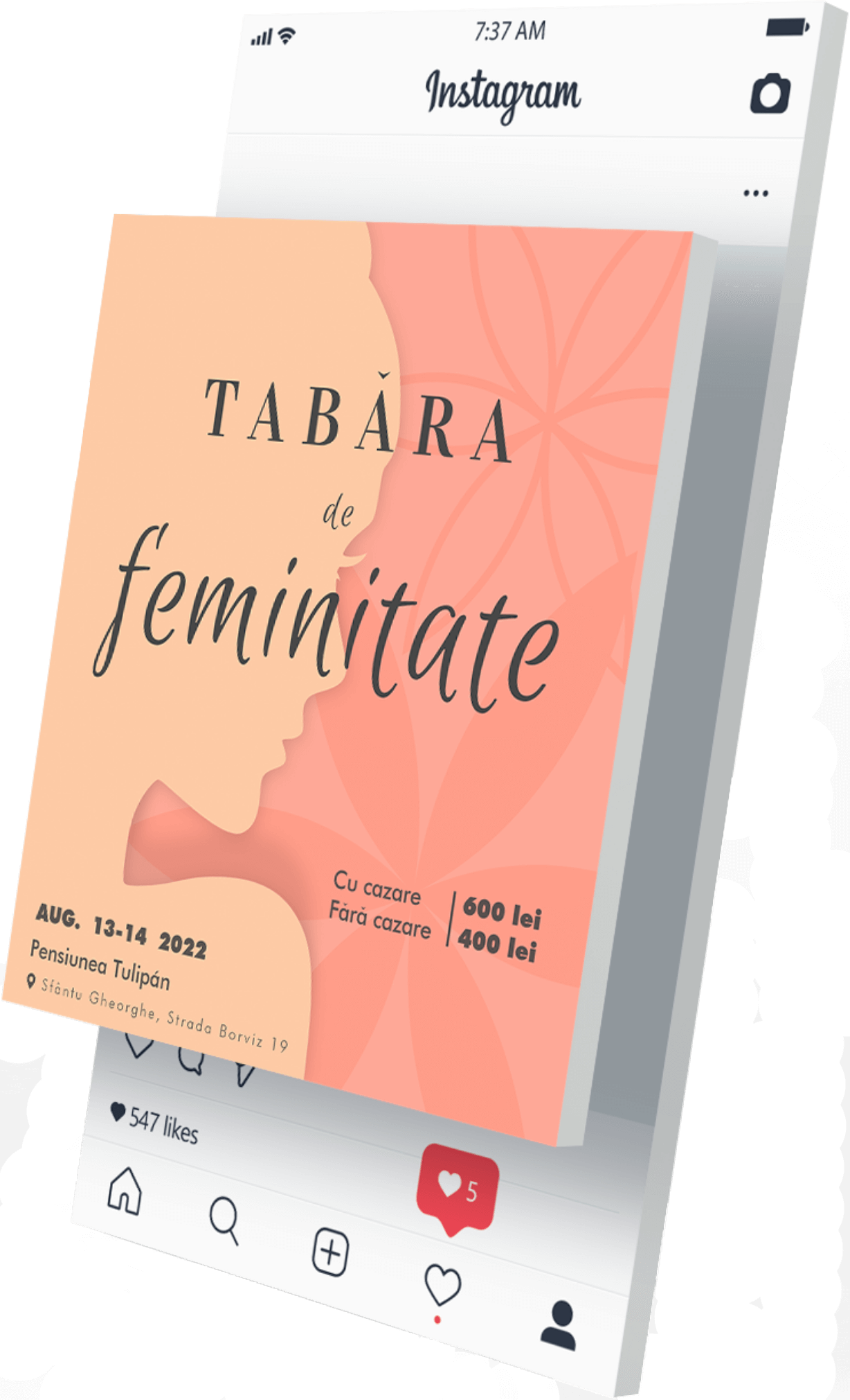
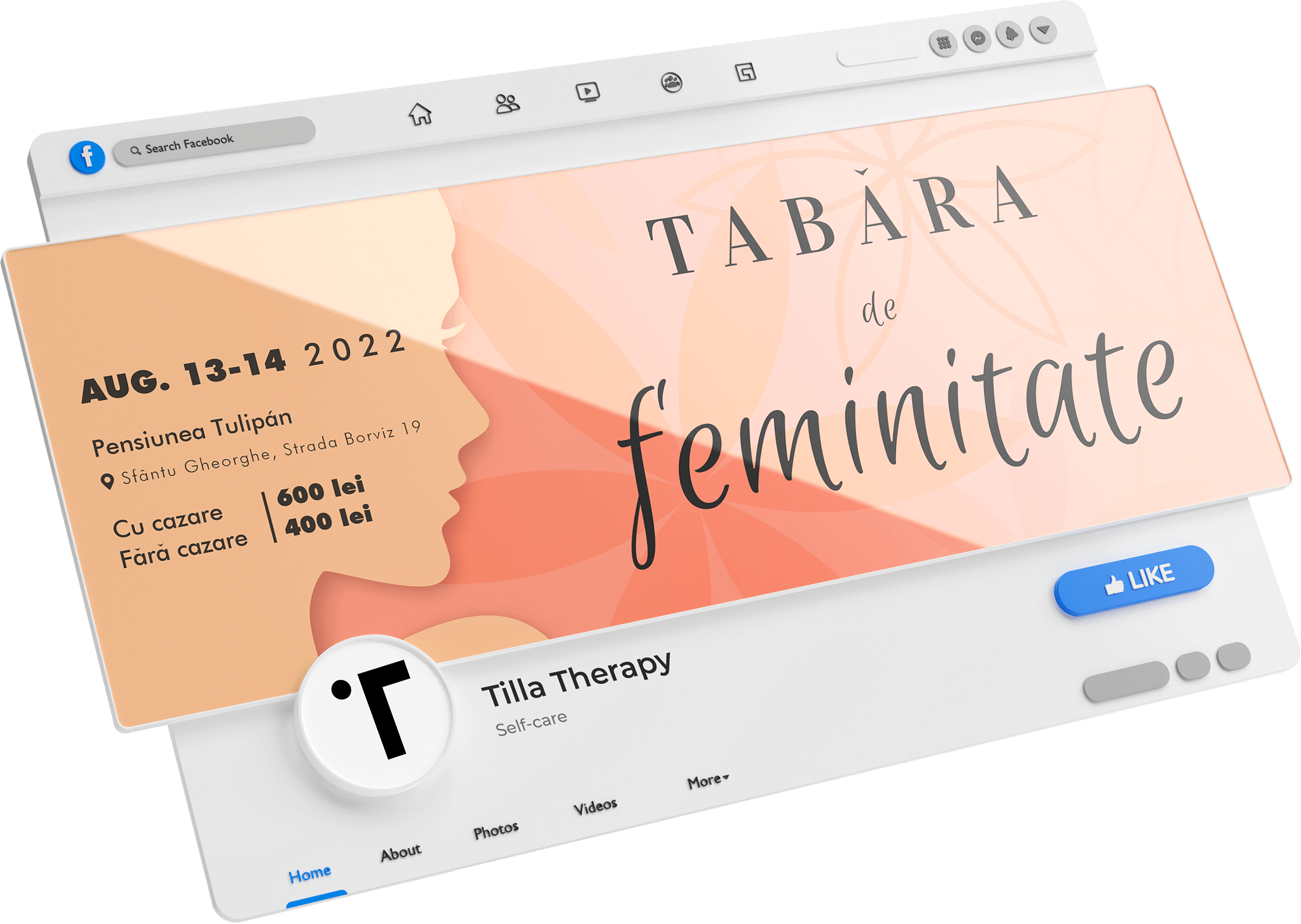
The client and attendees were delighted with the results, which were instrumental in promoting the event and encouraging attendance.
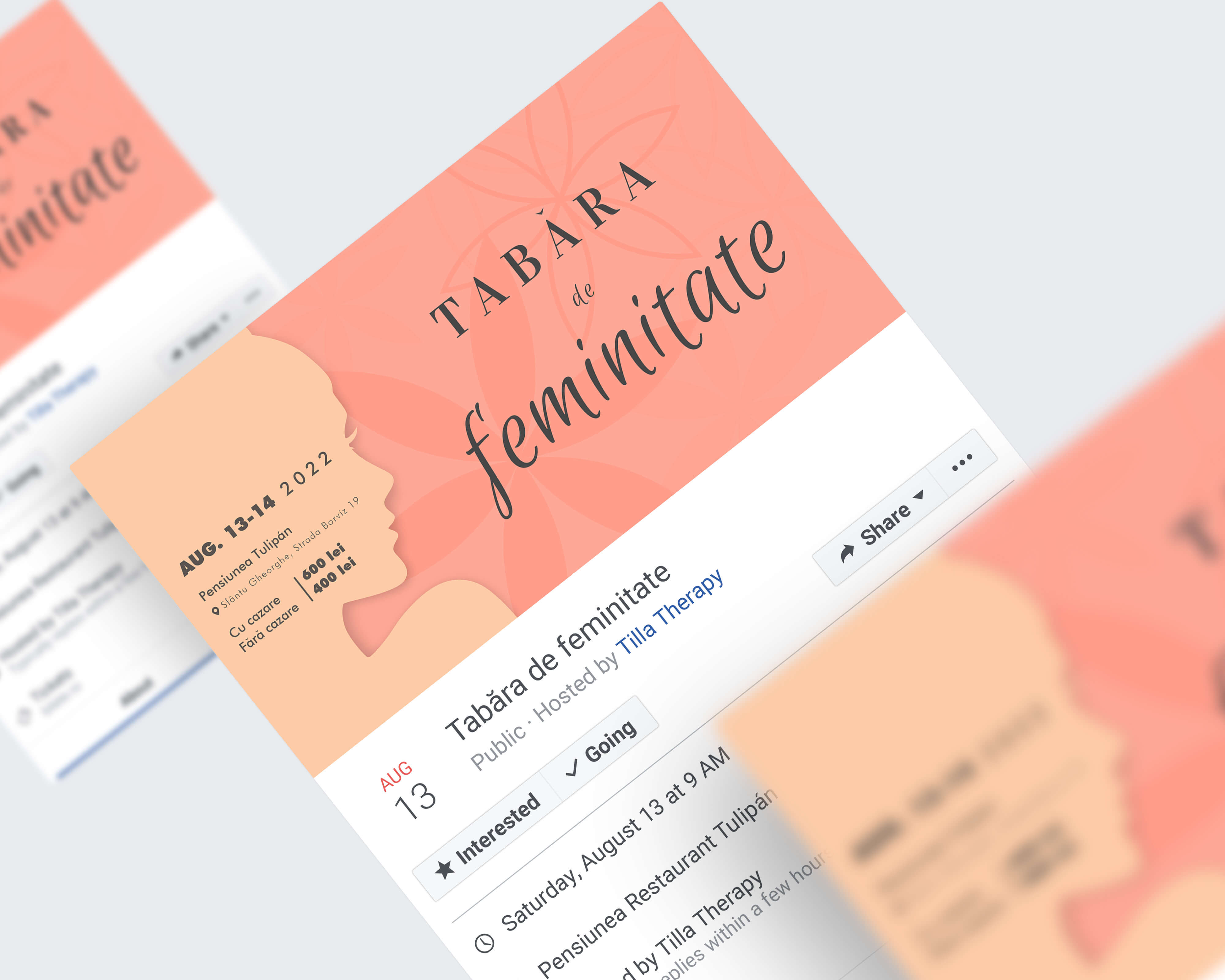
To achieve this goal, I worked closely with the client to understand their vision and to ensure that the design effectively communicated the theme and message of the event. I used a combination of color, typography, and illustration to encapsulate the message of the event.
![Figure 4.1.1 [mobile]](https://cdn.prod.website-files.com/6482f837d168606dacae7a4b/64e5fa41661faadddc1a33b3_Figure%204.1.1%20%5Bmobile%5D.jpg)
![Figure 4.1.2 [mobile]](https://cdn.prod.website-files.com/6482f837d168606dacae7a4b/64e5fa41d6de05986e8f919b_Figure%204.1.2%20%5Bmobile%5D.jpg)
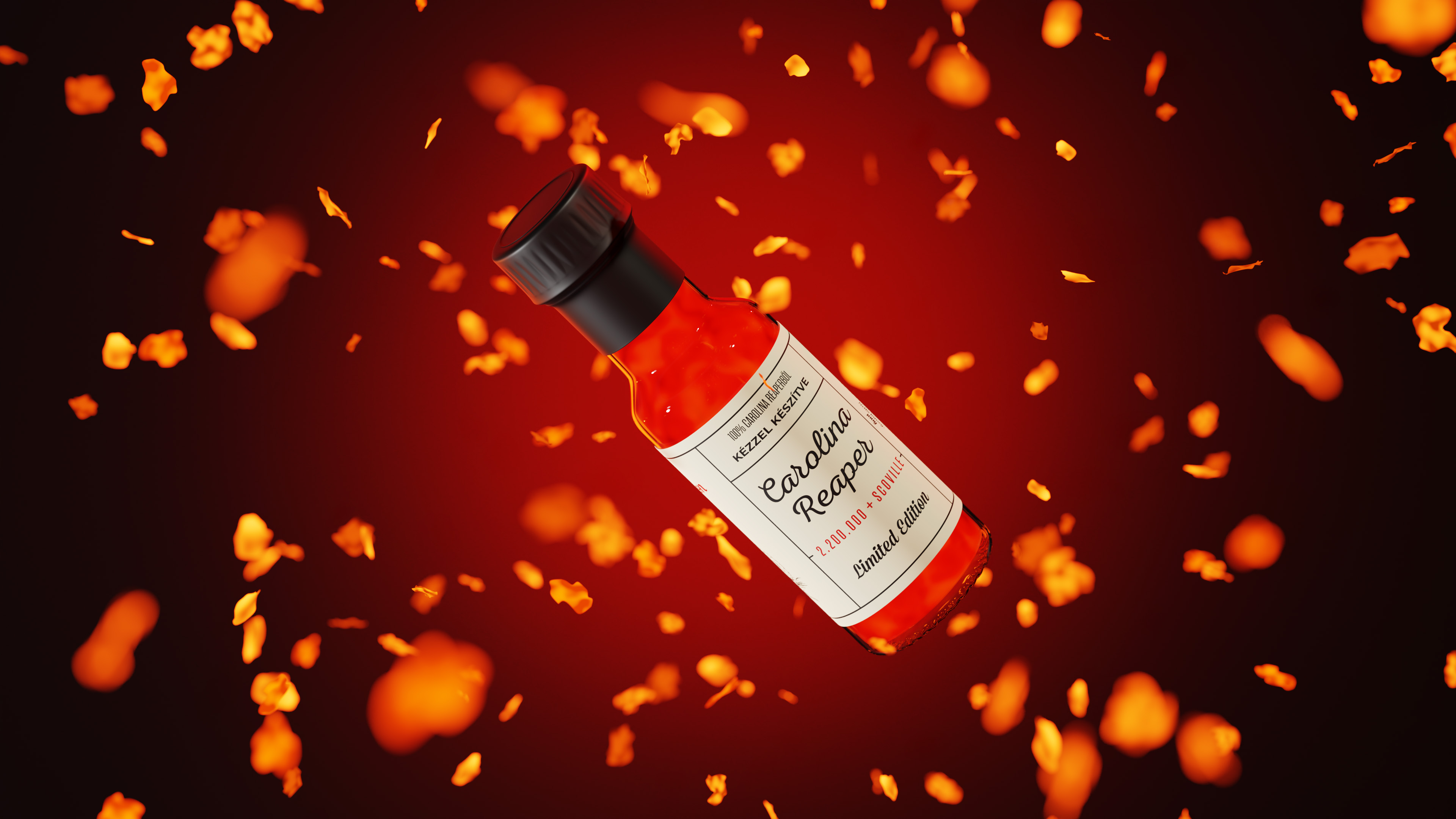
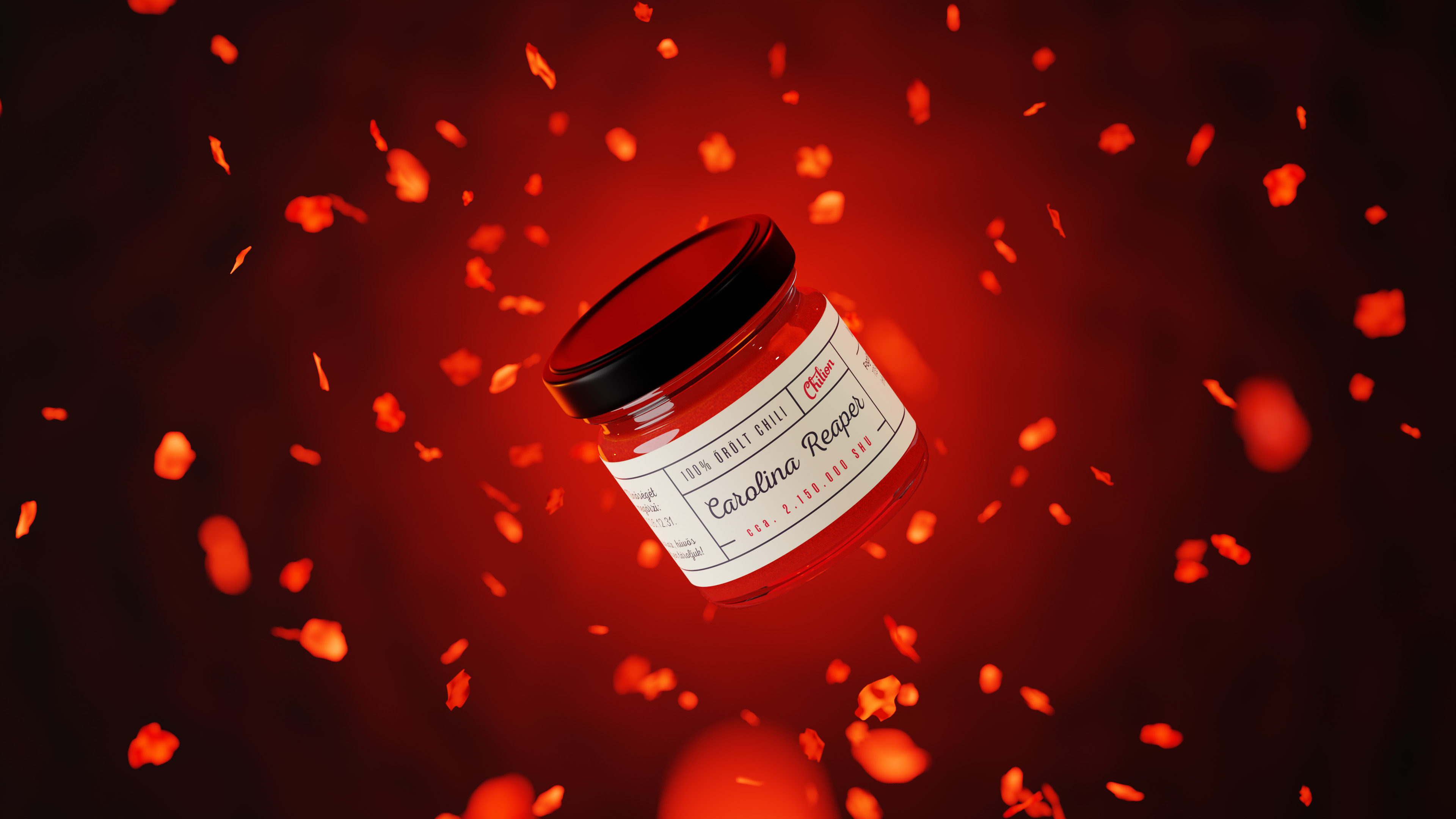
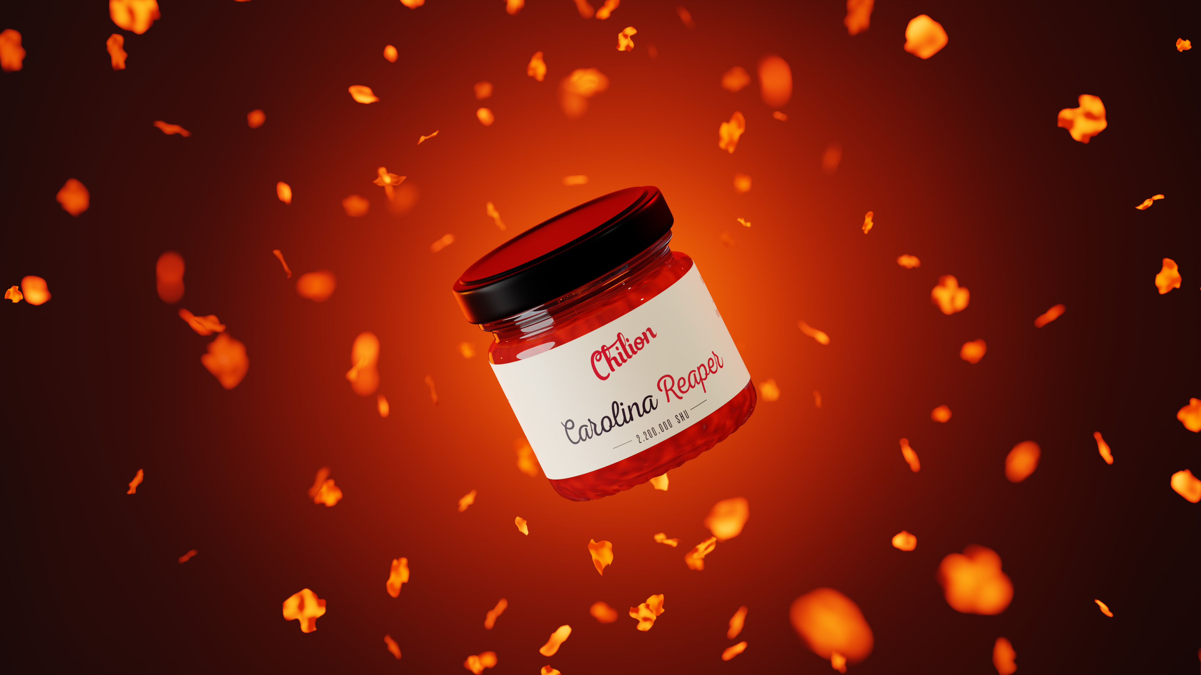
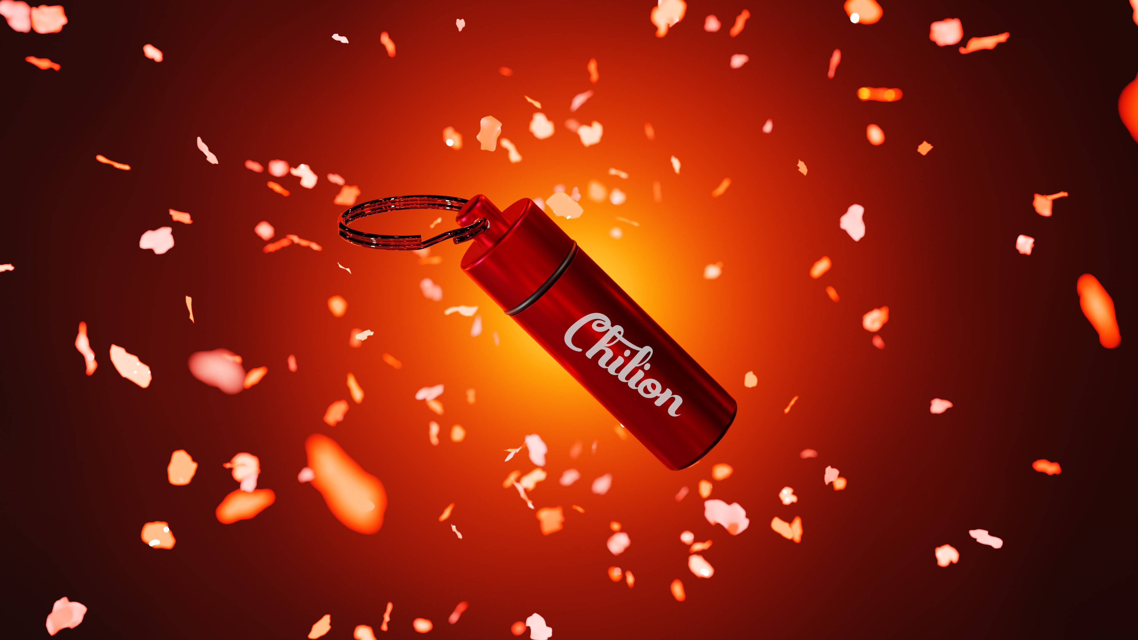
The Chilion project demanded the creation of captivating, premium quality 3D scenes to showcase an exquisite range of chili products. From the fiery essence within the bottles to meticulously designed embers, this project delved into every detail of the products.
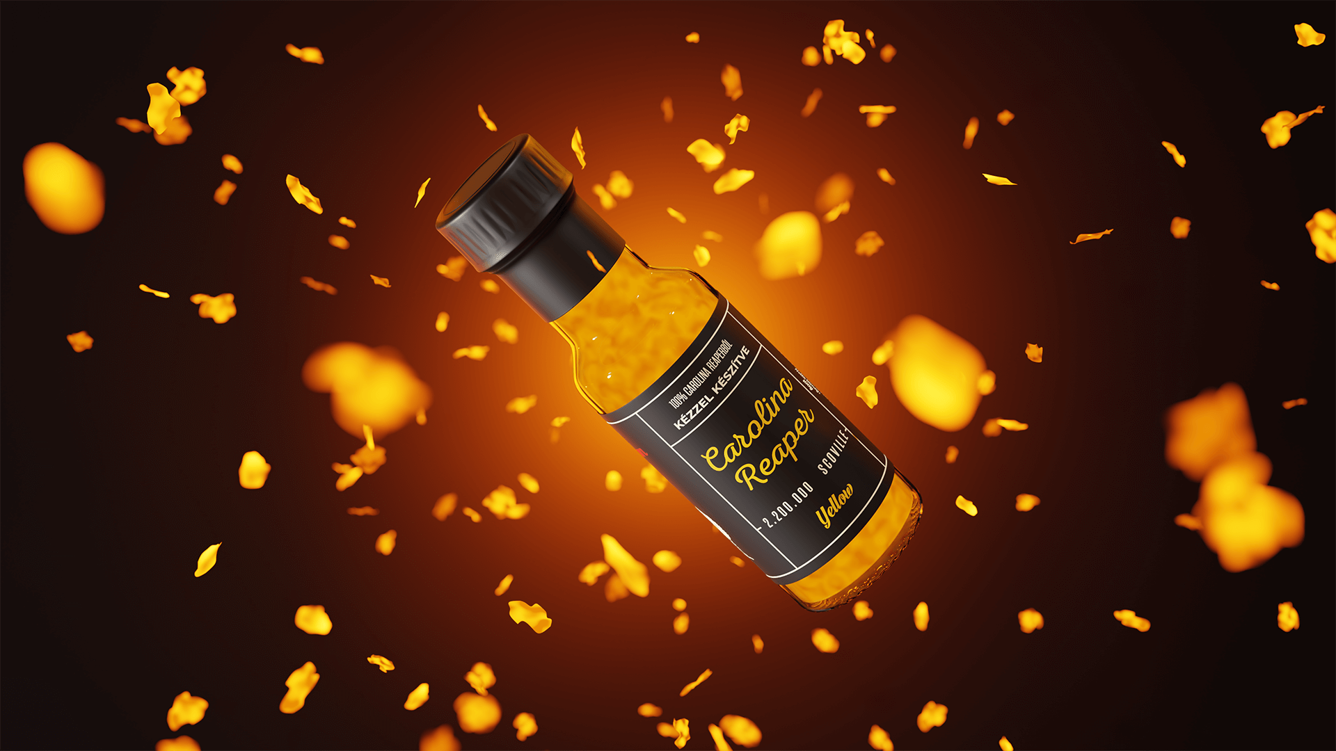
After a productive discussion with the client, the final decision was to artistically showcase the products in an environment that ignites the senses, evoking the fiery essence of taste and adventure. The 3D scenes were carefully curated to entice and engage the brands target audience.

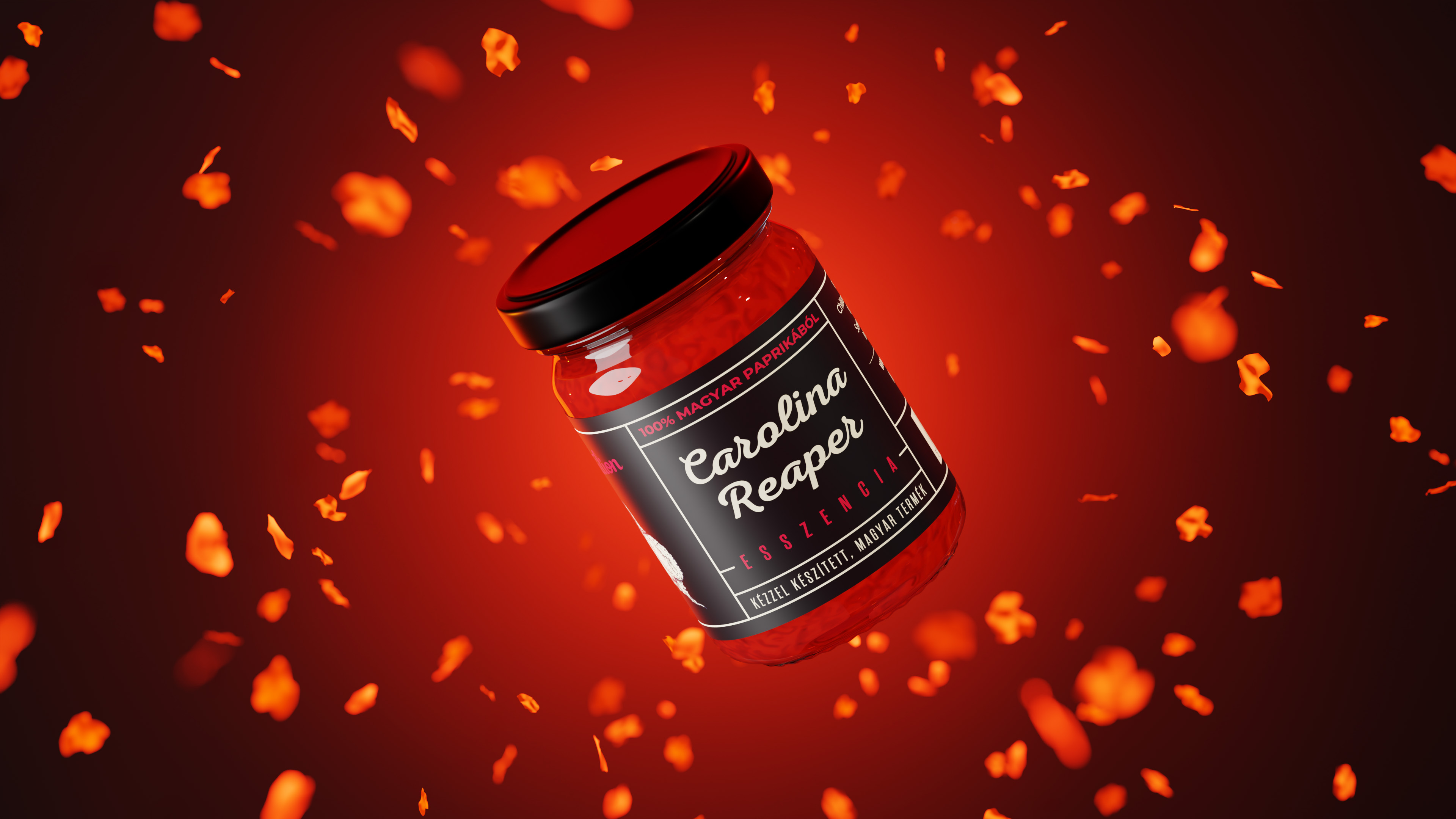
The Chilion project was a masterful endeavor, breathing life into a captivating range of chili products through cautiously crafted 3D scenes. Every element, from the intense essence encapsulated within the bottles to the intricate design of embers, received the utmost attention and artistry.

Following insightful conversations with the client, a resounding artistic choice emerged — to present these culinary delights in environments that ignited the senses, resonating with the fervent spirit of taste and exploration.

Following insightful conversations with the client, a resounding artistic choice emerged — to present these culinary delights in environments that ignited the senses, resonating with the fervent spirit of taste and exploration.


Vitaluxe embodies a premium skincare brand crafted for wellness-oriented consumers. The project involved creating an upscale visual identity, cohesive packaging design, and detailed branding elements to enhance consumer perception and engagement.
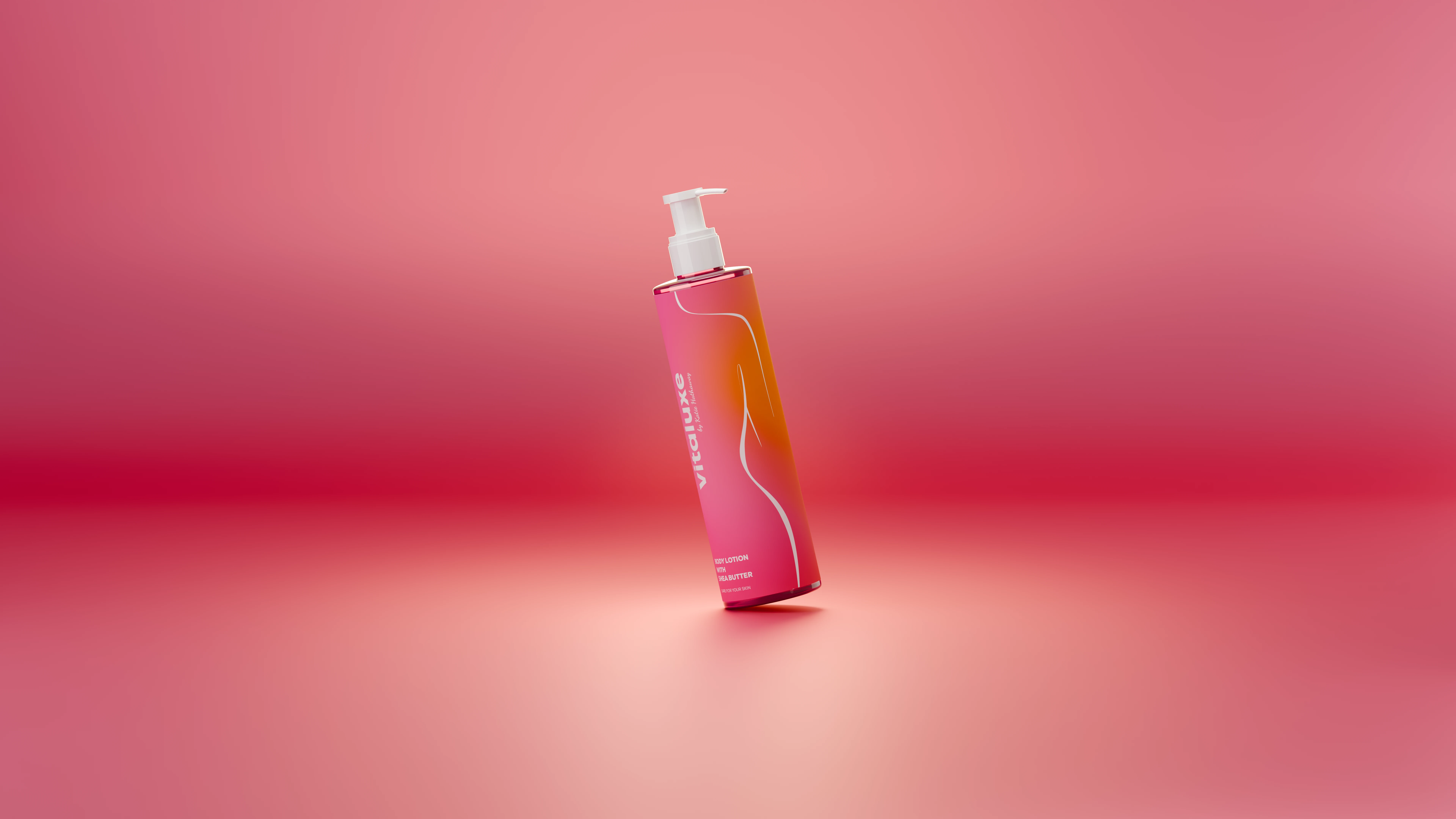
The visual identity featured sophisticated typography, a refined color scheme, and natural design motifs to evoke luxury and health. Custom icons, patterns, and layouts were developed to strengthen brand recognition and aesthetic harmony.
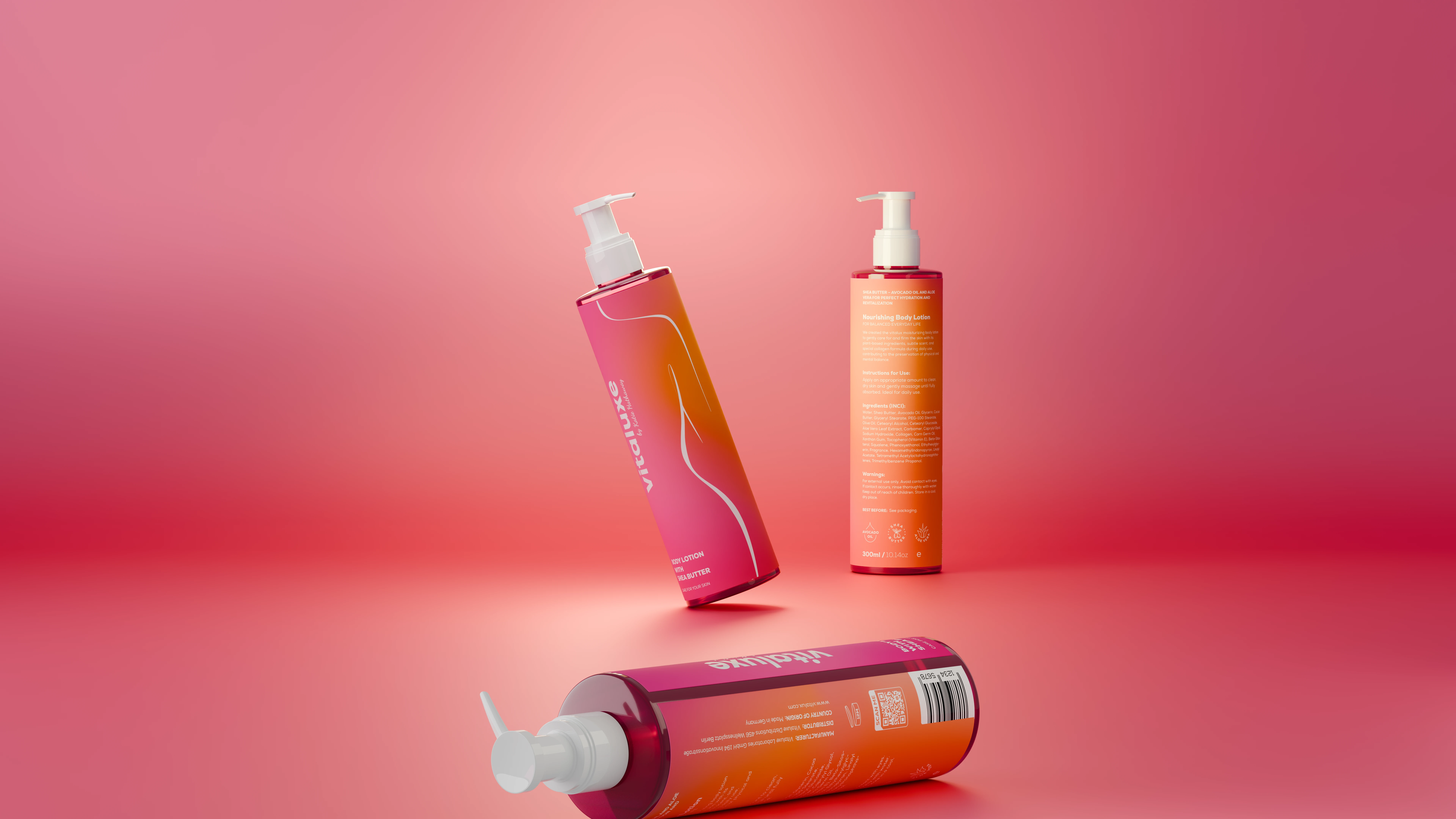
The final deliverables included comprehensive brand guidelines, packaging prototypes, and sustainable material recommendations. The result was an elevated brand experience that aligned with high market standards and consumer expectations.
